Which Features Are Considered Most Attractive in Celebrities? Exploring CelebA Dataset
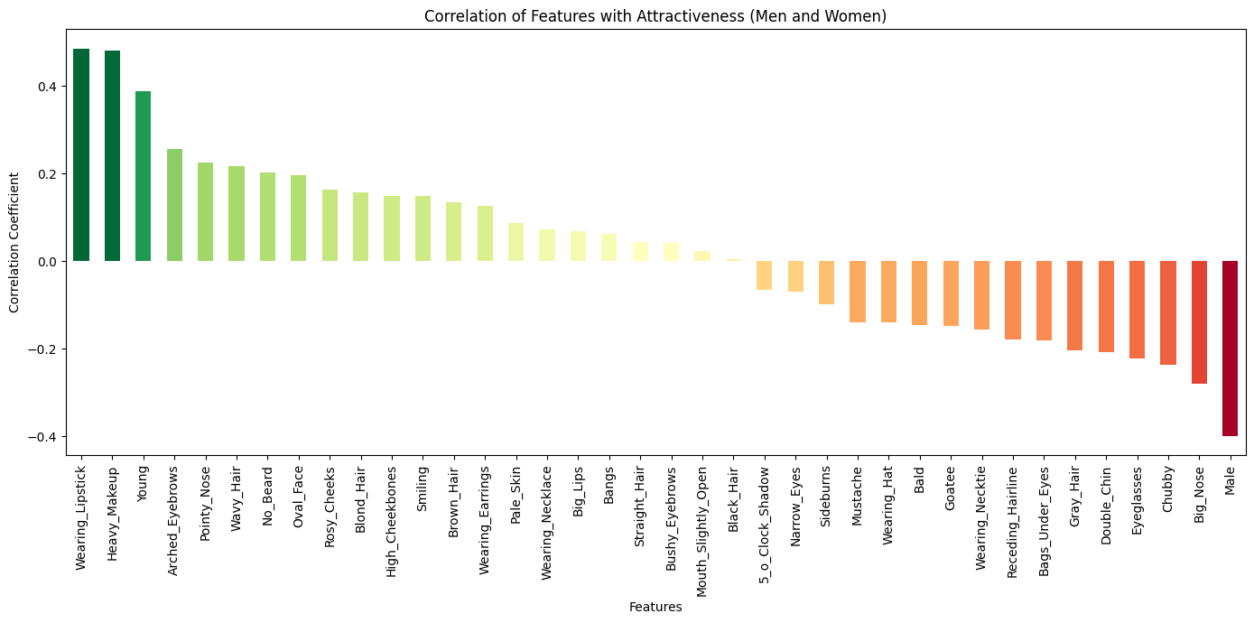
The plot is showing the correlation with images marked attractive in
CelebA dataset
with the features they have. CelebA or Large-scale CelebFaces Attributes is a
dataset published with the paper Deep Learning Face Attributes in the Wild. The dataset contains images of celebarities with various facial features
like Gray_Hair, Wearing_Necktie,
High_Cheekbones and an additional column named
Attractive. They are all marked in binary -1/1 for yes/no like
so:
| image | 5_o_Clock_Shadow | Arched_Eyebrows | Attractive | Bags_Under_Eyes | Bald | Bangs | Big_Lips | Big_Nose | Black_Hair | Blond_Hair | Blurry | Brown_Hair | Bushy_Eyebrows | Chubby | Double_Chin | Eyeglasses | Goatee | Gray_Hair | Heavy_Makeup | High_Cheekbones | Male | Mouth_Slightly_Open | Mustache | Narrow_Eyes | No_Beard | Oval_Face | Pale_Skin | Pointy_Nose | Receding_Hairline | Rosy_Cheeks | Sideburns | Smiling | Straight_Hair | Wavy_Hair | Wearing_Earrings | Wearing_Hat | Wearing_Lipstick | Wearing_Necklace | Wearing_Necktie | Young |
|---|---|---|---|---|---|---|---|---|---|---|---|---|---|---|---|---|---|---|---|---|---|---|---|---|---|---|---|---|---|---|---|---|---|---|---|---|---|---|---|---|
| image | -1 | 1 | 1 | -1 | -1 | -1 | -1 | -1 | -1 | -1 | -1 | 1 | -1 | -1 | -1 | -1 | -1 | -1 | 1 | 1 | -1 | 1 | -1 | -1 | 1 | -1 | -1 | 1 | -1 | -1 | -1 | 1 | 1 | -1 | 1 | -1 | 1 | -1 | -1 | 1 |
According to who? Bias:
Due to the subjective nature of the question I should, first of all, clarify who and how the data was labelled. It's mentioned in the paper:
Each image in CelebA and LFWA is annotated with forty face attributes and five key points by a professional labeling company
The paper is published by The Chinese University of Hong Kong, It's likely labelled by a local company reflecting the local preferences and biases. Ultimately it is their interpretation of a subjective thing.
How?
I'm using Huggingface's datasets library for accessing the dataset. Pandas and Matplotlib for further processing and visualisation respectively.
1. Import libraries and load the:
from datasets import load_dataset
import pandas as pd
import matplotlib.pyplot as plt
# Load the dataset
dataset = load_dataset('tpremoli/CelebA-attrs')
2. Drop the non-numeric columns
trim_dataset = dataset.remove_columns(['image','prompt_string', 'Blurry'])
df = pd.DataFrame(trim_dataset['train'])
3. Calculate the correlation of 'Attractive' column with other numeric columns.
# Calculate correlation with the "Attractive" feature
correlation = df.corrwith(df['Attractive'])
correlation = correlation.drop('Attractive')
# Sort values for better visualization
sorted_correlation = correlation.sort_values()
We've also dropped the column that we're comparing other columns with for cleaner visualisation. The correlation of a column with itself is always going to be 1 anyway. That is not insightful.
4. Plot the data.
import numpy as np #for color interpolation
# Plotting General
plt.figure(figsize=(14, 7))
# Map correlation values to colors indicating direction and magnitude with RdYlGn colormap.
colors = [plt.get_cmap('RdYlGn')(i) for i in np.interp(sorted_correlation, (min(sorted_correlation), max(sorted_correlation)), (0, 1))]
sorted_correlation.plot(kind='bar', color = colors)
plt.title('Correlation of Features with Attractiveness (Men and Women)')
plt.xlabel('Features')
plt.ylabel('Correlation Coefficient')
plt.tight_layout()
plt.show()
We're coloring the bars here into positive (green) and negative (red). We're also using a gradient of colors with magnitude of correlation so the bars at the either end are darker.
Further Analysis
Below are some further plots I thought would be interesting to see.
Separating Men and Women plots
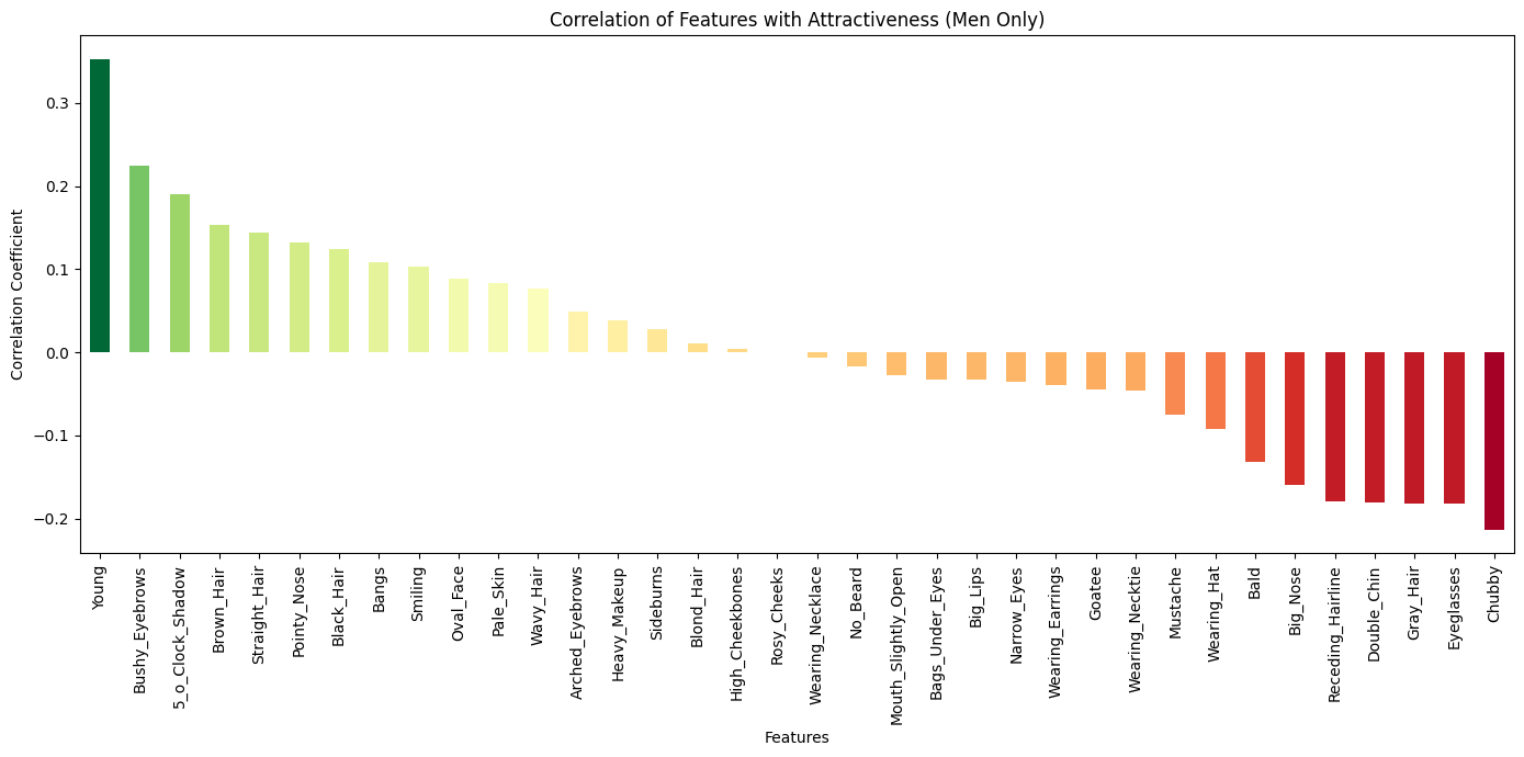
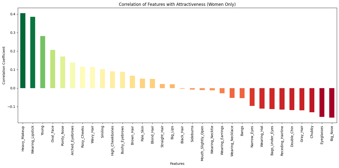
There's a column (Male) that marks whether the image is of a male or not. We can filter the dataset and plot the correlations separately.
#male and female only df. based on where the column 'Male' is 1 or -1
df_men = df[df['Male'] == 1].drop(columns='Male')
df_women = df[df['Male'] == -1].drop(columns='Male')
# men only correlation
men_correlation = df_men.corrwith(df["Attractive"])
men_correlation = men_correlation.drop(['Attractive', 'Wearing_Lipstick'])
men_sorted_correlation = men_correlation.sort_values(ascending=False)
# women only correlation
women_correlation = df_women.corrwith(df["Attractive"])
women_correlation = women_correlation.drop(['Attractive', 'Mustache', 'No_Beard', '5_o_Clock_Shadow', 'Goatee', 'Bald'])
women_sorted_correlation = women_correlation.sort_values(ascending=False)
Then plot the graphs as before.
Spread of Attractive features
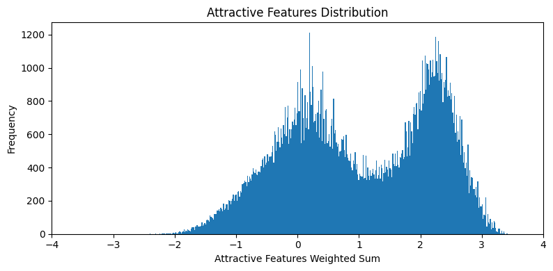
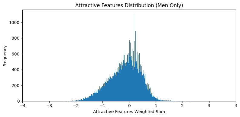
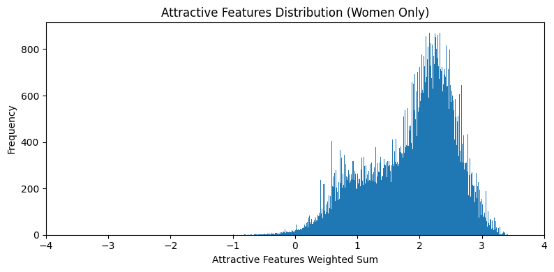
The spread plots are calculated by first computing a count of positive
features present in each sample. The count is weighted by the correlation
coefficient of that feature with the Attractive column. Artificial
features Heavy_Makeup, Wearing_Lipstick,
Wearing_Earrings were dropped. The absence of a negatively
correlated features isn't counted against the sample.
# Create a new DataFrame, here it's a simple copy of 'df' for demonstration
att_sum_df = df.copy()
# drop non natural columns
natural_correlation = correlation.drop(columns=['Heavy_Makeup', 'Wearing_Lipstick', 'Wearing_Earrings', 'Wearing_Necklace', 'Wearing_Necktie', 'Wearing_Hat'])
# Add an index column
att_sum_df['index'] = range(len(att_sum_df))
# Initialize 'attractive_sum' column to 0
att_sum_df['attractive_sum'] = 0
# Iterate over column names. dataframe['column'] can select the entire column across all rows
for feature in natural_correlation.index:
	# this multiplies the entire 'feature' column with its correlation value
    # and adds it to the 'attractive_sum' column
    # Only marks the presence of the feature, not its absence
att_sum_df['attractive_sum'] += (att_sum_df[feature] == 1) * natural_correlation[feature]bins = 400
# calculate the symmetric range from all distribution plots
import math
x_range = max(abs(att_sum_df['attractive_sum'].min()), abs(att_sum_df['attractive_sum'].max()))
x_range = math.ceil(x_range)
# Plot the distribution of 'attractive_sum'
plt.figure(figsize=(8, 4))
plt.hist(att_sum_df['attractive_sum'], bins=bins)
plt.title('Attractive Features Distribution')
plt.xlabel('Attractive Features Weighted Sum')
plt.ylabel('Frequency')
plt.tight_layout()
plt.xlim(-x_range, x_range)
plt.show()
# Plot the distribution for Men only
plt.figure(figsize=(8, 4))
plt.hist(att_sum_df[df['Male'] == 1]['attractive_sum'], bins=bins)
plt.title('Attractive Features Distribution (Men Only)')
plt.xlabel('Attractive Features Weighted Sum')
plt.ylabel('Frequency')
plt.tight_layout()
plt.xlim(-x_range, x_range)
plt.show()
# Women only
plt.figure(figsize=(8, 4))
plt.hist(att_sum_df[df['Male'] == -1]['attractive_sum'], bins=bins)
plt.title('Attractive Features Distribution (Women Only)')
plt.xlabel('Attractive Features Weighted Sum')
plt.ylabel('Frequency')
plt.tight_layout()
plt.xlim(-x_range, x_range)
plt.show()Top and bottom samples
You can use the weighted sum column to sort and filter images.Following is top
5 and bottom 5 where High_Cheekbones == 1. This disparity in
the plots above is showing in the sample images.
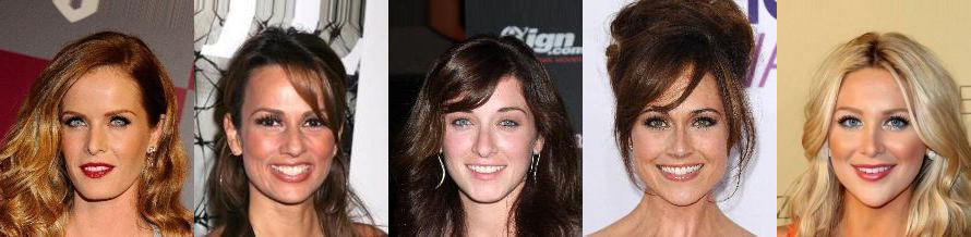
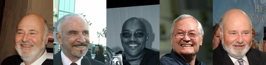
display_top_bottom_images(att_sum_df[(att_sum_df['High_Cheekbones'] == 1)], dataset, n=5)
I am using a simple function I wrote for this for picking out top 5 or bottom 5 images and stichting them together.
You can download the python notebook here.